Client
-
Case Study
SONOTUBE® NEW PRODUCT LAUNCH
-
The Challenge
ASSESSMENT
Sonoco Products invented the disposable concrete form.
Over the fifty years since its invention, the Sonotube was becoming the generic name for round concrete fiber forms. This resulted in an erosion of market share, as any brand was being delivered when a “sonotube” was ordered. The client needed a new image for the product after an innovative rain-resistant property was added to the product. -
The Solution
STRATEGY
Create a distinctive look and image for the new product in the marketplace, emphasizing its heritage of innovation. Create a product naming discipline that stressed the brand name with the shapes and properties unique to Sonotube. Project an image of dominance and strength with which the construction worker would identify.
IMPLEMENTATION
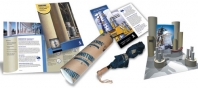
Products were renamed to force distributors to clarify brand AND specific product attributes (i.e. Sonotube Square instead of a SonoSquare). Agency also redesigned the product “packaging” to be more distinctive on the jobsite and also developed STAND STRONG™ as the new tagline (in 3 languages). A 20 x 20 exhibit was designed for the World of Concrete show using the product as conference room and storage spaces. Separate literature was developed for distribution at the trade show (user oriented) and for sales reps (distributor oriented). Also, three direct mailers were developed for use in different sales channels. -
The Results
RESULTS
Client reported a 10 percent increase in market share within six months of the product launch.
Campaign Elements Include:
• Product feature logo
• Tagline development and language localization
• Package design
• Brochures and fliers
• POP demo stand and product spec sheet
• Exhibit design
• Location photography
• Direct mail program with incentives
-