Color Marketing Group Previews 2021+ Regional Key Colors
Alexandria, VA, September 24, 2020 --(PR.com)-- The 2021+ Regional Key Color preview by Color Marketing Group, the leading international association of color design professionals, was revealed earlier this month. Comprised of 4 Key Colors, including a pale blue, a dark saturated violet, a vibrant red, and a warm neutral with a red undertone, these directional hues are forecasted to emerge on the market in 2021.
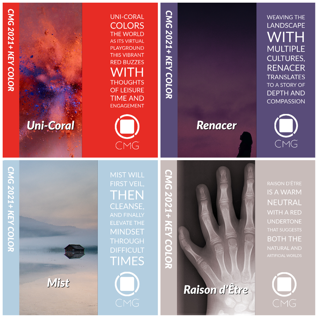
Mist is a pale blue hue, touched with a whisper of toned grey and minimal chroma, is spirited in its lightness.
Mist will first veil, then cleanse, and finally elevate the mindset through difficult times and emerge determinedly into the newly established decade. It is selected, and shall be embraced, to encompass the mood, desire, and fantasy of new growth.
Despite global events, it is an encouraging moment for design and Mist is a color that suggests the transcendence in creating new products and design solutions. Determined by CMG North American color experts in 2019 to emerge in as the 2021+ Key Color, the pale blue color of Mist suggests an uninhibited look at the future. Mist has neither gender nor age, making it ideal for fashion and consumer electronics, as well as transportation. With its ability to take on varying sheen levels and special effects with ease, Mist is an easy color to embrace.
Renacer represents femininity and masculinity and its high saturation suggests the energy of forward movement.
Preview a 2021 color that is a dark, highly saturated violet hue that connects nature and spirituality. Renacer, a CMG Latin American Key Color for 2021+, embodies the rebirth in Latin America. Latin American color experts determined that it embraces multiple elements of society, amidst the spectre of global events.
Weaving the landscape with multiple cultures, Renacer translates the multiplicity of the region to a complex hue that reflects the DNA of its internal color influences. Red and blue merge to create the underlying violet color, and black is added to create depth and a mature definition.
Able to tell a story of depth and compassion, Renacer will appear in graphics in print and digital works with its balanced, yet powerful look. Packaging and consumer goods will also embrace this hue as a color with a powerful message, but still connects to the past, nature, and humanity.
Uni Coral exudes motivation and drive, perfect for instant attention and long-lasting energy.
The desire for new, innovative aesthetics is always intriguing, and despite global events, color continues to inspire through many lenses. Uni Coral, Color Marketing Group’s Asia Pacific 2021+ Key Color, will emerge to visually celebrate the perceived energies of the globe.
Uni Coral colors the world as its virtual playground and as the virtual world has become ever more important, the idea of this hue is even more prescient. The vibrant red buzzes with thoughts of leisure time and engagement, being involved in a busy life, but taking a moment to step back and allow devices and AI to take on some of the tasks.
It is a trend direction for color that is well-suited to pop-up culture from events to retail to fashion. Pop-up shops can be physical, if done safely, or virtual, but are always energized and of the moment. Uni Coral exudes motivation and drive, perfect for instant attention and long-lasting energy. Its playful quality grants a much-needed sense of joy.
Raison d’être is a color of balance to see lifestyles and the world on its many levels.
Welcome to "Planet Living Room" and the preview of a color that is, indeed, a pre-view. Raison d’être is at once earthy and slightly synthetic in appearance. It is a warm neutral with a red undertone that suggests both the natural and artificial worlds.
Determined by color experts at CMG’s European meetings in 2019 as a key color for emergence in 2021+, Raison d’être is the connection between nature and the built environment, that the entire planet is home and needs endless respect. Raison d’être is a color of balance to add comfort and sense of reason.
Raison d’être will be found across all industries, with emphasis given to special effects, finishes and textures. The variation in effects add to the balancing nature of the color and create a “just right” application whether transportation, fashion, home décor, or anything else. The subtle depth of Raison d’être suggests the need for profundity in a superficial and fast-moving world with ongoing global events shifting almost everything.
These color trend stories can be found at Colormarketing.org/media-page.
About Color Marketing Group’s World Color Forecast™
Color Marketing Group’s multi-industry color design professionals collaborate globally to arrive at their directional color palette of 64 colors. These forecasted colors are supported by color stories that contain each color’s drivers and influences two years ahead. Each of the four global regions identifies their Key Color from their 16 forecasted colors. Product designers across all industries have been influenced by Color Marketing Group’s World Color Forecast for over 58 years.
About Color Marketing Group®
Color Marketing Group®, founded in 1962, is a not-for-profit international association of color design professionals who forecast color directions and is a forum for the exchange of all aspects color. Members represent a broad spectrum of designers, marketers, color scientists, consultants, educators, and artists. Color forecasting events are held throughout the world and the results from these events become part of the global World Color Forecast™ revealed at the annual International Summit. More information is available at www.colormarketing.org.
Connect Online:
Instagram: @ColorSells
Twitter: @ColorSells
Facebook: @ColorSells
Media Contact: sgriffis@colormarketing.org
Contact
Color Marketing Group
Sandra Sampson - VP PR & Communication
703-329-8500
http://www.colormarketing.org/
Sandra Sampson - VP PR & Communication
703-329-8500
http://www.colormarketing.org/
Multimedia

Categories